![]()
Want a website that not only converts but also gives users an exceptional UX, user experience? So, what are some of the elements of great UX?
Learnability: Can users figure out how to work your site on their first visit?
Memorability: Is it easy for users to remember how to use the site on subsequent visits?
Ease-of-use: Can users navigate your site because its navigation is consistent?
Errors: Do users make errors? If they do, can they recover quickly?
Efficiency: How quickly can users complete the task at hand?
Appeal: Do users feel positive while interacting with your site?
One of the easiest ways to test your site’s UX is with a Heuristic Evaluation. An advantage of this approach is that it is easier than many other kinds of UX testing. It requires understanding a set of the 10 design principles developed by Jakob Nielson in the early 1990s that have been adapted for the web.
Here’s how to do it:
Find 3-5 people to become well versed in the 10 principles in this post. Then, have each person walk through your site to find violations to the principles.
Tip: If you have a large site, focus your evaluators on the top 3-5 pathways.
Each time an evaluator finds a problem, he or she should describe it and which principle it violates. Some violations will be on a single page; others will be part of the site structure. The more detail the evaluator includes, the easier it will be for the developers or design team to fix the issue.
Have the evaluator rate the severity of each violation based on three factors:
Frequency: Is the problem common or rare?
Impact: How much does the violation impede the user?
Persistence: Once the user overcomes the error the first time, will it continue to be an issue?
Use a 0-4 scale, with 4 being the most severe. Then, work on fixing the worst violations first.
Here is a very simple example of a record of a violation:
Violation Description: The header images on the homepage and product pages are not the same size.
Pages: www.example.com, www.example.com/products
Principle Violated: Consistency & Standards
Severity: 3
That’s enough talk about logistics. Let’s dive into the 10 design principles from The Nielsen Norman Group and my own examples of greatness in applying each of them.
10 Heuristic Principles
1. Visibility of system status- “The system should always keep users informed about what is going on, through appropriate feedback within reasonable time.”
If your page, image, etc., is loading, be sure to let your user know! Similarly, if users have to take steps to complete an action, let them know where they are in the process.
Example of excellence: Urbanoutfitters.com
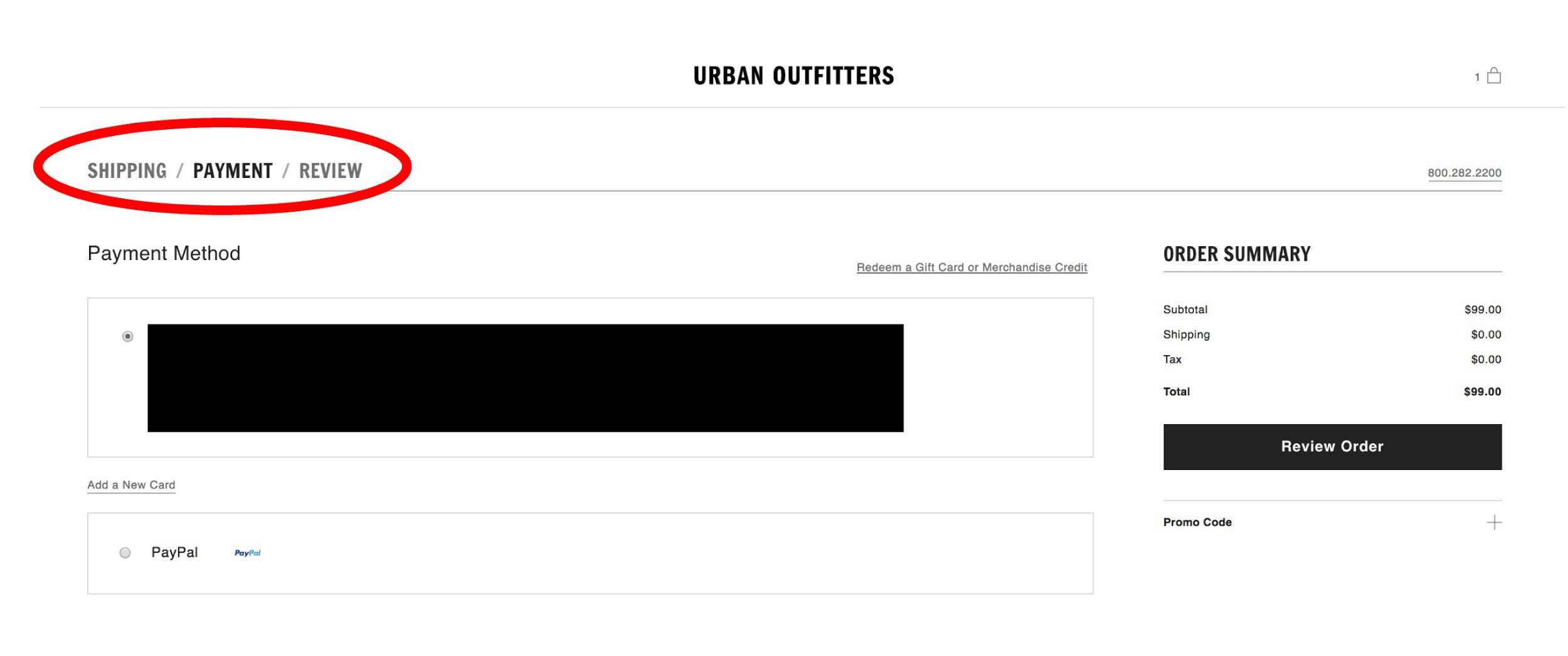
Why it’s great: Urban Outfitters makes making a purchase clear and easy to navigate.
2. Match between system and the real world – “The system should speak the users’ language, with words, phrases, and concepts familiar to the user, rather than system-oriented terms. Follow real-world conventions, making information appear in a natural and logical order.”
Use language and symbols that your visitor uses in the real world.
Example of excellence: Pandora.com
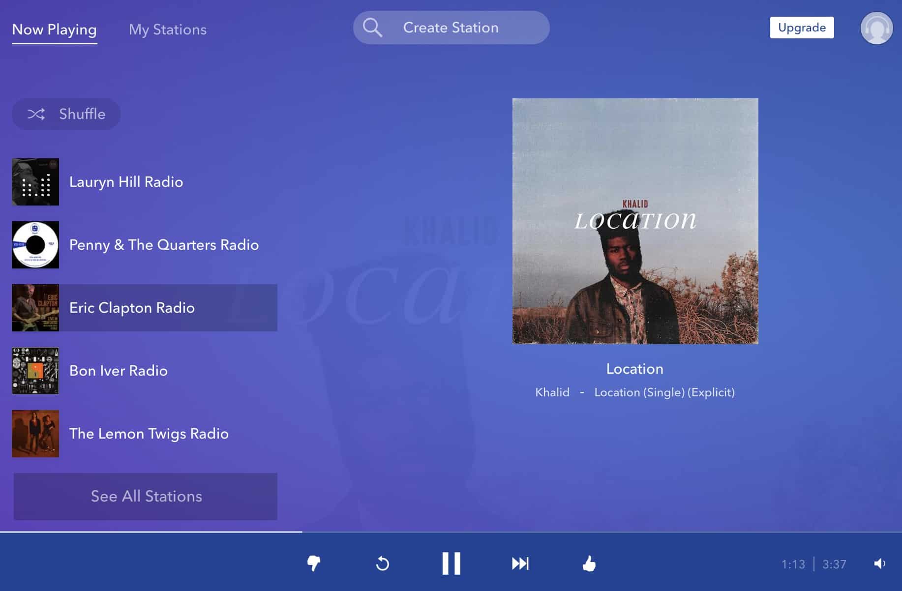
Why it’s great: Pandora uses the language radio listeners already know. Even the buttons look familiar.
3. User control & freedom – “Users often choose system functions by mistake and will need a clearly marked “emergency exit” to leave the unwanted state without having to go through an extended dialogue. Support undo and redo.”
If users make a mistake, they should be able to fix it with ease.
Example of excellence: Gmail.com
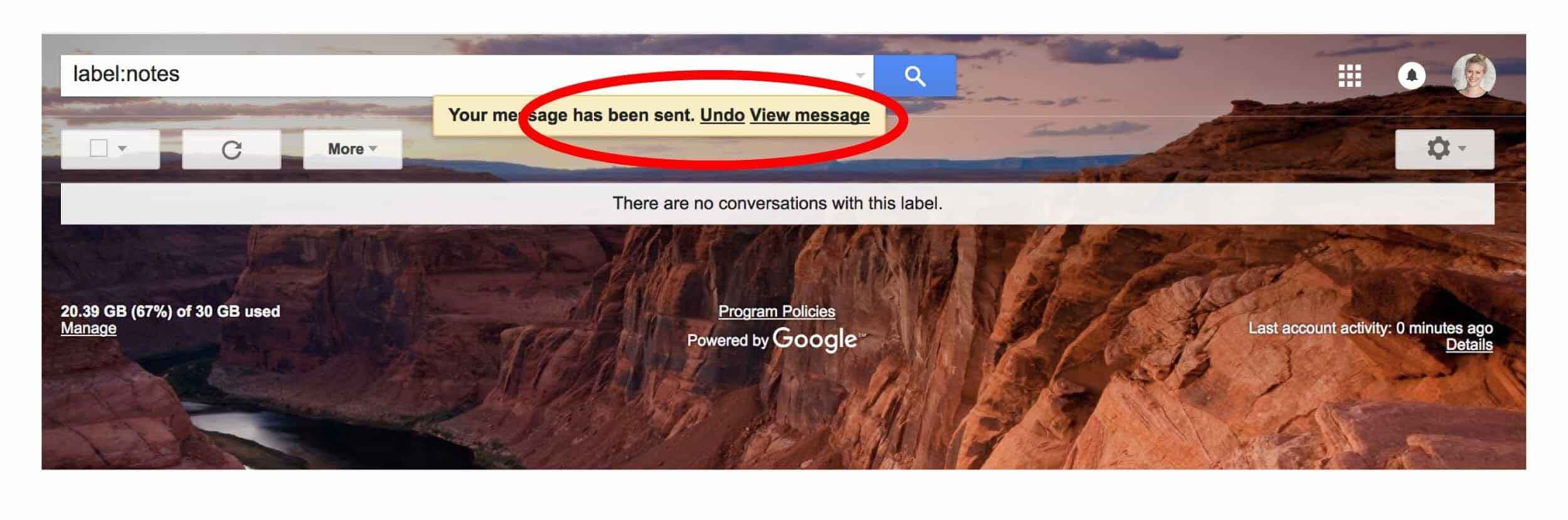
Why it’s great: It’s easy and simple to take action if you’ve accidentally pressed sent too soon.
4. Consistency & standards – “Users should not have to wonder whether different words, situations, or actions mean the same thing.”
Be consistent in your use of styles and symbols throughout your site.
Example of excellence: Navigation bars for Adobe.com, Microsoft.com, and Starbucks.com
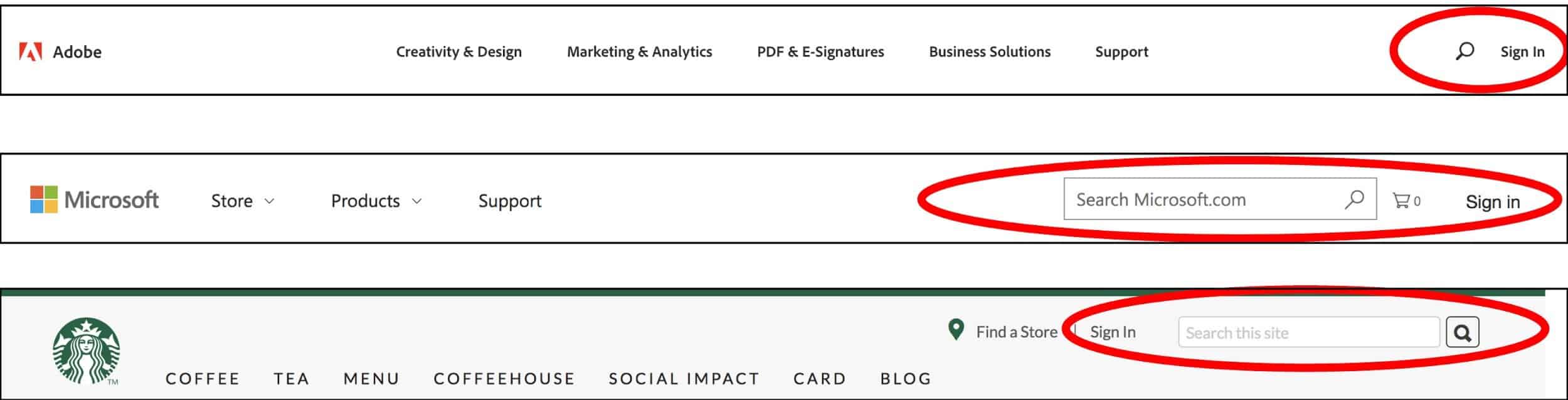
Why it’s great: We are used to looking for sign-in and search functions in the upper right. These established sites make it easy for users by putting information where we expect it to be.
5. Error prevention – “Even better than good error messages is a careful design which prevents a problem from occurring in the first place. Either eliminate error-prone conditions or check for them and present users with a confirmation option before they commit to the action.”
Alert users to possible errors and help them avoid them.
Example of excellence:
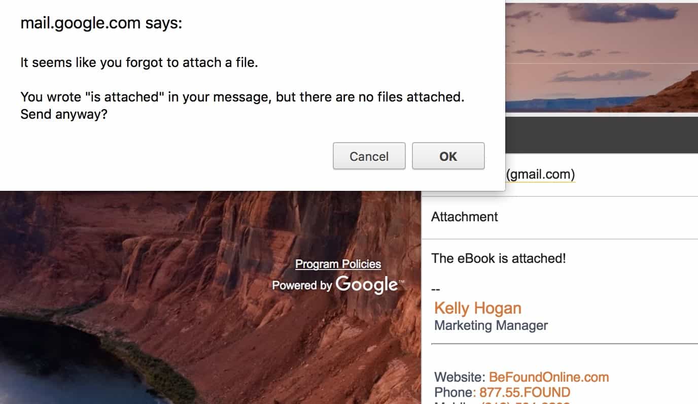
Why it’s great: The message is simple, concise and once again, Gmail saves me from looking like a fool!
6. Recognition rather than recall – “Minimize the user’s memory load by making objects, actions, and options visible.”
Don’t make me have to remember it or think about it.
Example of excellence: iHeartRadio.com
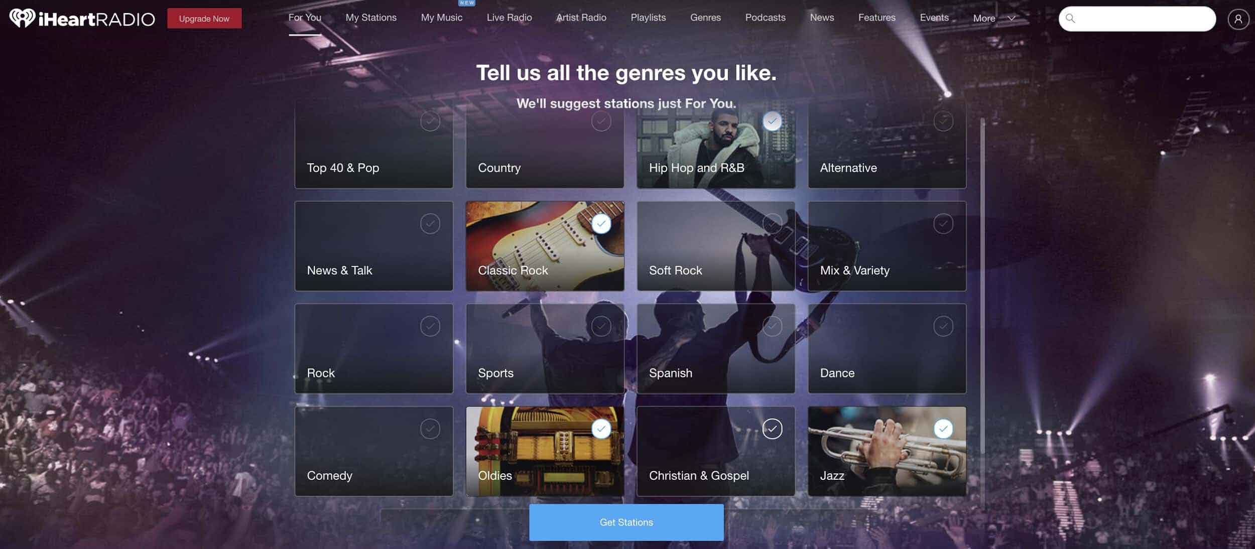
Why it’s great: iHeartRadio gives users a list of genres to choose from, rather than having them try to remember and enter their favorites. It’s much simpler to choose from a pre-made list than to create one from scratch.
7. Flexibility and efficiency of use – “Accelerators — unseen by the novice user — may often speed up the interaction for the expert user such that the system can cater to both inexperienced and experienced users. Allow users to tailor frequent actions.”
Create different paths for users of different skill levels so everyone can do what they need to do with the least amount of friction.
Example of excellence: Trello.com
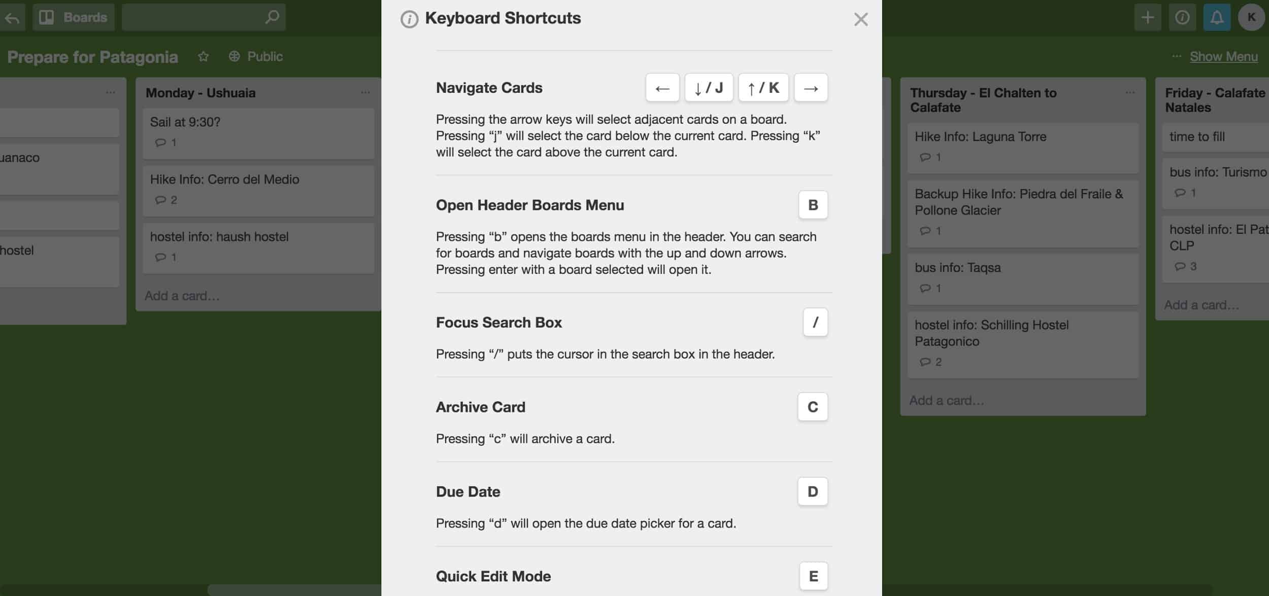
Why it’s great: Expert users of Trello can use keyboard shortcuts to save clicks.
8. Aesthetic & minimalist design – “Dialogues should not contain information which is irrelevant or rarely needed. Every extra unit of information in a dialogue competes with the relevant units of information and diminishes their relative visibility.”
Give only the most pertinent information for your user and minimize distractions.
Example of excellence: Google.com
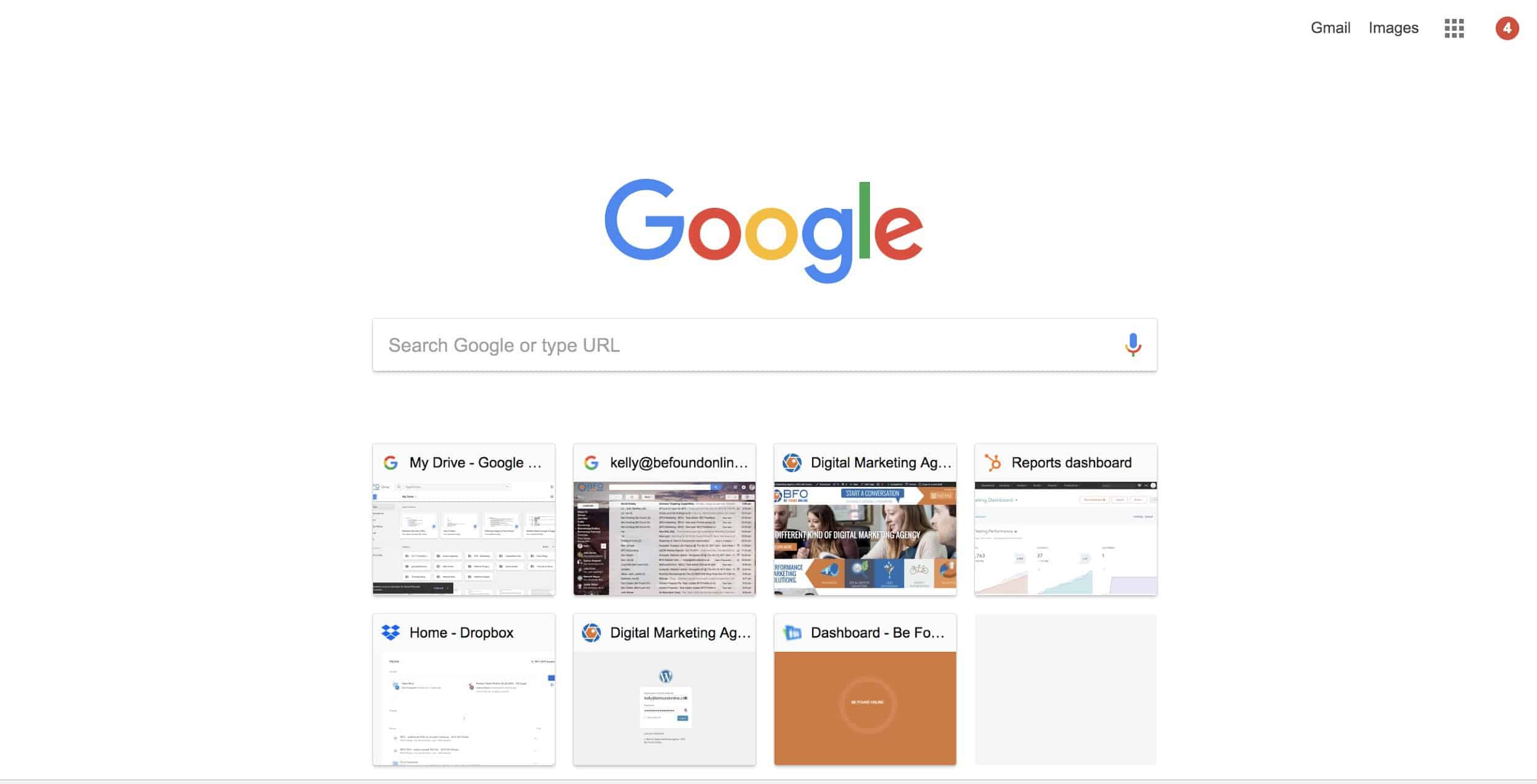
Why it’s great: Google knows why we’re on their most popular page and doesn’t offer more than what we need.
9. Help users recognize, diagnose & recover from errors – “Error messages should be expressed in plain language (no codes), precisely indicate the problem, and constructively suggest a solution.”
If users make an error, make sure to tell them why they couldn’t complete their action and then suggest another way for them to get it done!
Example of excellence: Apple.com
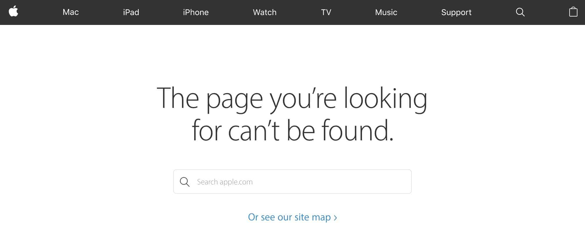
Why it’s great: First of all, it’s not some error 404 secret code. It’s everyday language and gives you a path to find what you were looking for.
10. Help & documentation – “Even though it is better if the system can be used without documentation, it may be necessary to provide help and documentation. Any such information should be easy to search, focused on the user’s task, list concrete steps to be carried out, and not be too large.”
Have easy to use help and documentation available for the users who lose their way.
Example of excellence: DePaul.edu
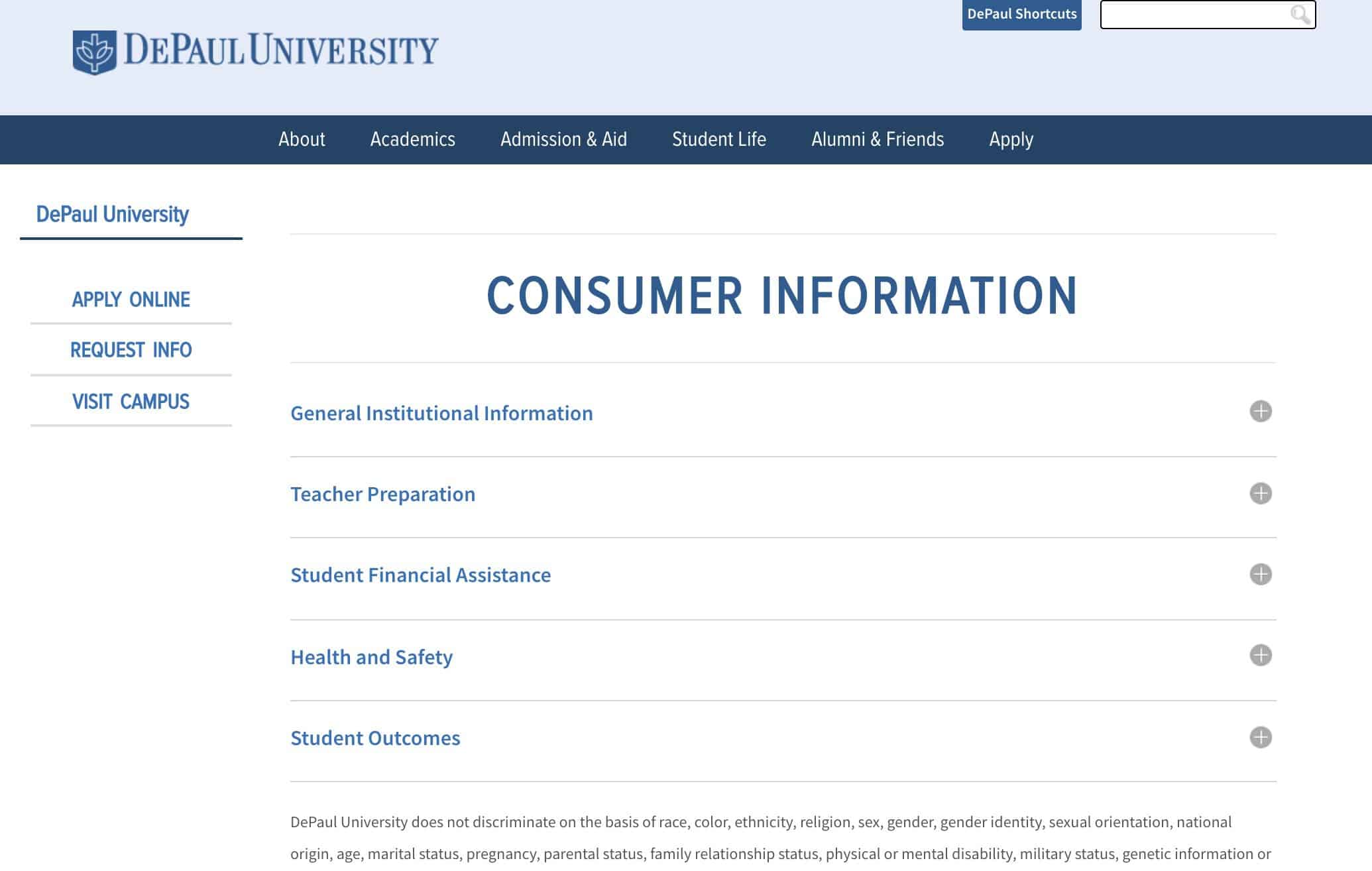
Why it’s great: DePaul is a large site, but this page makes it easy for visitors to find the information that is most relevant to the task they are trying to complete.
The principles of great UX are well understood, but nearly every site has a violation of one or more. If you would like help improving your site’s UX or help using inbound marketing to bring the right visitors to your website, be sure to reach out to the experts at Be Found Online.

SUBSCRIBE TO OUR BLOG
Stay up to date with the latest industry best practices in digital marketing!


.png?width=339&height=179&name=Webinar%20Banner%20(1).png)


.png?width=339&height=179&name=July%20Webinar%20(Newsletter).png)

.png?width=339&height=179&name=Webinar%20Banner-April-02%20(1).png)
%20(4).png?width=339&height=179&name=Webinar%20Banner-May-02%20(1)%20(4).png)


.png?width=339&height=179&name=March%202023%20Webinar%20Ad%20(autoresponder).png)


.svg)
.svg)
.svg)

%20(1).svg)
.svg)
.svg)

.svg)