
Use Auto Updating Dashboards to Get Your Data More Efficiently
What if instead of you going out to get your data or making data requests, the data came to you. Image a situation where all you had to do was log in and see your data from all of your digital sources (ex. analytics, SEM ads, call tracking, CRM). You would easily be able to tell the health of your business instead of having several meetings to go over every data source. This would be your auto updating reporting dashboard.
Now that you thought of it as a business who is investing in digital marketing, think of it from the standpoint of the digital marketer. How much time could this save you on all of those reports you send out? The answer – a ton! As long as you are willing to think about your reports a little differently.
Thinking About Your Reports Differently
A dashboard is a very different style of report. So many times, we are used to giant spreadsheets or massive decks with 100 or more slides. Your clients may have gotten used to them as well, since they tend to grow more and more with historical data (new columns/slides added every month).
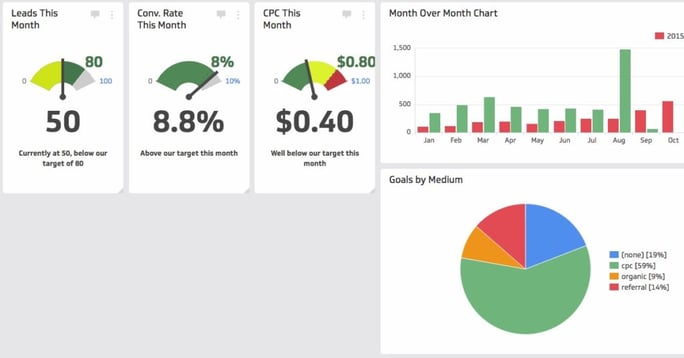
With all that data, it can become cluttered and difficult to follow along. A dashboard gives you the answers right away, meaning that old data is not displayed. The only thing needed now is the screen.

Take for example, a report that every month a new column is added to show month over month changes. At the end of a year, you will have a minimum 12 columns, with the first column being the description of the line items. That data can get cluttered and is easy to get lost in. Instead, a dashboard could show 4 columns TOTAL.
You’re thinking I’m crazy right? Your client would never go for that. But, what if they could see the health of their account much more quickly without having a one-hour meeting to walk them through the data? Now that is something worth investing in! If anything, it will make you look smarter.
The columns I would suggest would be:
- Column 1: The description of the line item
- Column 2: The data from 2 months ago
- Column 3: The data from 1 month ago
- Column 4: The percentage of difference between the data from 2 months ago and 1 month ago.
Every time a month goes by, your data automatically “moves” over, meaning the data from 1 month ago becomes data from 2 months ago, and new data goes into the column that used to hold the data from 1 week ago. The percent difference is calculated automatically. If a longer term view is needed, you can always include a small graph off to the side to show month over month trends.
That’s all for now folks!
Reporting will continue to change and evolve over time as the data platforms get more and more complex. It’s important to remember in this digital age of increasing complexity to keep it simple! Part of our job as reporters is to be able to take the data and turn it into information that is easily understood by our clients.
If you missed the first part of this series, head to the beginning!

SUBSCRIBE TO OUR BLOG
Stay up to date with the latest industry best practices in digital marketing!


.png?width=339&height=179&name=Webinar%20Banner%20(1).png)


.png?width=339&height=179&name=July%20Webinar%20(Newsletter).png)

.png?width=339&height=179&name=Webinar%20Banner-April-02%20(1).png)
%20(4).png?width=339&height=179&name=Webinar%20Banner-May-02%20(1)%20(4).png)


.png?width=339&height=179&name=March%202023%20Webinar%20Ad%20(autoresponder).png)


.svg)
.svg)
.svg)

%20(1).svg)
.svg)
.svg)

.svg)