Data Studio is a powerful reporting tool and we want to help you get the most out of it. This article isn’t a “getting started” or “how-to” guide for Data Studio, though, because setting up a basic report is actually quite simple. There are tons of YouTube videos to help you get started, plus free report templates, a user-friendly interface, and several drag-and-drop features. These features allow anyone to make beautiful and insightful reports without having to be a Data Studio expert.
What you will find in this blog post is an answer to a challenge my colleague presented me with: How can I make a sessions trend graph using Google Analytics data in Data Studio?
This challenge may sound super easy to solve, but I surprisingly couldn’t find the answer, even after searching all over the internet. Our client needed to view sessions from certain pages and not simply total site or paid media sessions. This meant figuring out which pages belonged to which categories, combining all of these pages into the categories the client requested, and then re-labeling all of the pages. This probably sounds confusing right now, but I promise it will make sense in a minute if you just hang tight. Let’s walk through the solution I ended up discovering step-by-step.
PHASE 1
To start, you’ll need to do two things: 1.) Create a custom dimension, and 2.) Use regex.
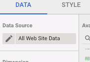
Step 1: Edit the data source in Data Studio by clicking on the pencil.
Here’s where the party really gets started. We’re now ready to create an advanced custom dimension, but the process is far more complex than if we were creating something as simple as a ROAS calculation.
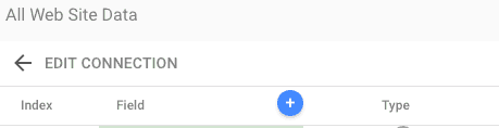
Step 2: Click on the blue circle with the plus sign inside.
Step 3: Now the party is really heating up. It’s time to name the custom dimension and put some regex to work using the “REGEXP_MATCH” function.
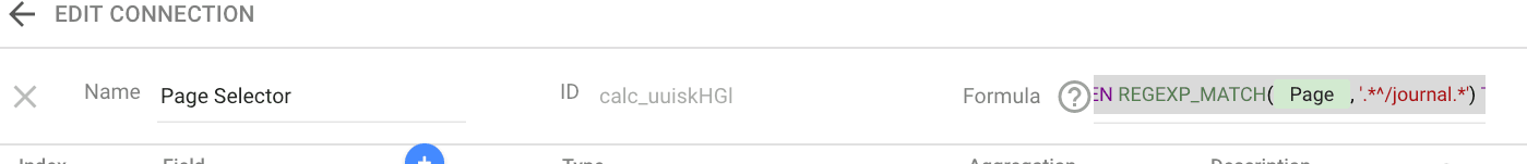
First, you can name the new custom dimension as you see fit. I chose “page selector.” Now on to the fun part: labeling the pages. The formula below, which we will go through in a moment, needs to be placed directly into the “formula” field in the above screenshot. Here’s the formula you’ll be placing:
CASE WHEN REGEXP_MATCH(Page, ‘.*^/monitor.*’) THEN ‘Monitor’ WHEN REGEXP_MATCH(Page, ‘.*^/education.*’) THEN ‘Education’ WHEN REGEXP_MATCH(Page, ‘.*^/journal.*’) THEN ‘Journal’ WHEN REGEXP_MATCH(Page, ‘.*^/annualmeeting.*’) THEN ‘Meeting’ ELSE ‘All’ END
Now let’s break down the first part of this code.
CASE WHEN REGEXP_MATCH(Page, ‘.*^/monitor.*’) THEN ‘Monitor’ translates to “When Page ^ (the little carat guy means “starts with”) /monitor, label it as ‘Monitor’ and so on and so forth until all of the pages are neatly labeled under the correct categories. Basically, the code is looking for keywords in your page names and then sorting those pages into an associated category. This sorting allows us to report on each page category without having to manually label every single page.
Step 4: Click on “Create Field.”
The newly created custom dimension should appear with “text” automatically selected as the type. This is the type we want for our example.

Step 5: Click “Done.”
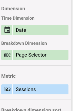
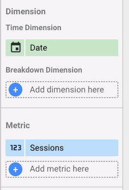
Step 6: For “Breakdown Dimension,” add the newly-created custom dimension found under the “Default Group” header. Then, select your preferred time dimension.
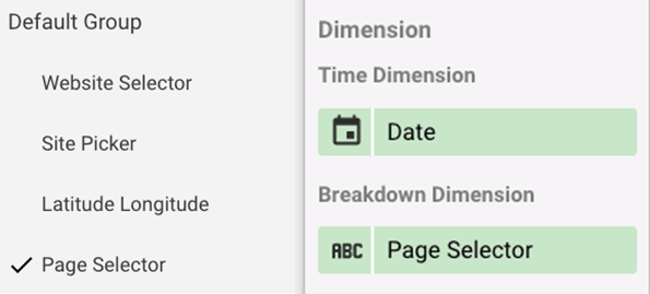
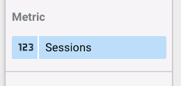
Step 7: Select “Sessions” as the metric.
Here’s a bird’s eye view of the settings control panel with everything filled in correctly:
Step 8: Admire the chart and run around in excitement.
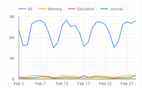
After all that running around and excitement, I was feeling pretty great (and pretty tired). Unfortunately, my celebration came to an abrupt end when I was told the client needed the chart to be interactive. He needed the ability to select one category at a time instead of seeing every category overlaid on the same chart. This request required a drop-down menu with all the categories listed in the menu, which brought me to phase 2 of the challenge.
I have to be honest. I browsed forums and asked my colleagues and analytical friends for answers, but I was told this was most likely impossible. Luckily, I’m here to save you from pulling out your own hair by showing you that it is, in fact, possible!
Phase 2: Custom Drop-Down Menus
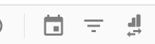
Step 1: Add a filter selector anywhere on the page by clicking the symbol with lines going from biggest to smallest in the upper right-hand corner. The mouse cursor will turn into a “+” sign, allowing you to draw a filter anywhere on the page.
When I did this step, my filter automatically defaulted to source. Don’t worry, we’ll update this in a minute.
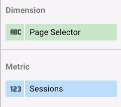
Step 2: Click on the “Sessions” chart to get to its control panel and remove” Page Selector” as the breakdown dimension. The breakdown dimension should now be blank.
Step 3: Now back to the filter. Click on the filter to get to its control panel and add the custom dimension.
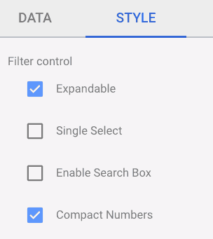
Step 4: Click on “Style” while in the filter control panel and make sure “Expandable” is selected.
Step 5: Get out of edit mode by clicking on “View” in the upper right-hand corner.
Step 6: Now that we’re out of edit mode, we can see if these updates were a success or not by clicking on the “Page Selector” filter.
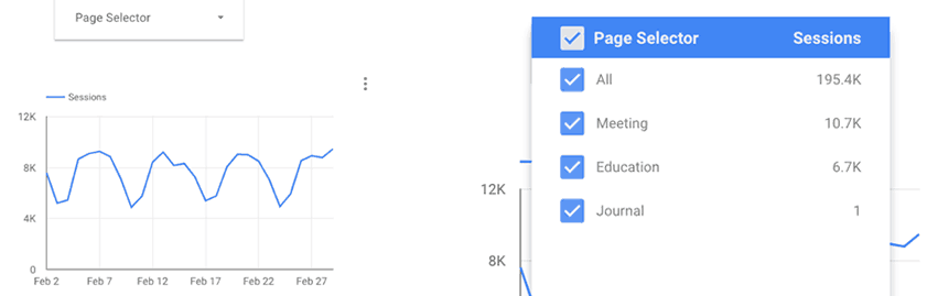
Step 7: Get your running shoes back on because we’re back to running around in excitement! Our client now has the ability to select “All” to view data for all categories or look at individual categories!
I hope this guide comes in handy for any of you using Data Studio as your go-to reporting tool. There could be another solution to achieve the same results, but these are the steps I took to tackle the challenge at hand. If you’re looking for additional help or information on all things digital marketing, please check out our Blog, Facebook, and LinkedIn pages! Like the way we think? Contact us here to work with us or visit our Careers Page to browse open positions.

SUBSCRIBE TO OUR BLOG
Stay up to date with the latest industry best practices in digital marketing!


.png?width=339&height=179&name=Webinar%20Banner%20(1).png)


.png?width=339&height=179&name=July%20Webinar%20(Newsletter).png)

.png?width=339&height=179&name=Webinar%20Banner-April-02%20(1).png)
%20(4).png?width=339&height=179&name=Webinar%20Banner-May-02%20(1)%20(4).png)


.png?width=339&height=179&name=March%202023%20Webinar%20Ad%20(autoresponder).png)


.svg)
.svg)
.svg)

%20(1).svg)
.svg)
.svg)

.svg)