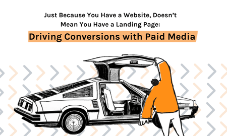
Just Because You Have a Website, Doesn't Mean You Have a Landing Page
January 30, 2023
6 Minute Read
Did you read the title of this blog? It’s right up there. If you haven’t, please give it a read.
Okay, cool. So, you’ve read it (maybe twice now?). I’m glad we’ve gotten that out of the way. This is never an easy conversation to have, but we can get through it together.
The goal of your website and its individual pages is to make you money. Full stop.
“But we’re running an awareness campaign.”
Right: Awareness of your products and services, which you exchange for money.
And your goal is to efficiently educate site visitors and get them quickly down the conversion path, with as few distractions as possible.
So what should your landing page do? Great question! Here’s a great answer in list form:
7 Things a Landing Page Should Accomplish
- Build trust and show visitors that you’re an expert at what you do
- Load quickly and be mobile friendly (yes, we’re still having this conversation)
- Not be bogged down with content
- Be visually and mentally appealing
- Align with your ads, ad copy, and audiences
- Drive site actions!
- Be free from distractions
Let’s unpack these things and then you can be on your way to stronger landing pages.
1. Building Trust and Showing Expertise
Your website and landing pages are the place to talk, no brag, about what you do and how site visitors can benefit from your products and services.
If you’re “Award Winning,” say it! If your product uses 50% less gigawatts than your competitor’s, visualize it with an infographic. If you’re a family-owned not-for-profit that’s been going for 172 years, include an image of Great Uncle Emmet Brown and talk about the work he did with students in Hill Valley. And if you’re targeting a niche customer base with unique needs, tell us that you understand, that you can relate, and that you have just what they need!
2. Page Load Time and Mobile Optimized
Statista says that mobile devices make up 59% of internet traffic, while Google’s recommended page load time is less than 2 seconds.
So, how do we ensure we’re good for mobile and have a fast load time?
3. Don’t Bog Your Page Down with Content!
If I search for plans to build a time machine and your ad comes up, when I click and land on your page I don’t need 6 pages on the history of time machines, a listicle of Jules Verne’s favorite factoids about H.G. Wells, followed by an op-ed on how they did it wrong in Napoleon Dynamite – all before I even get to the place on your page with the Call to Action button that opens the form that I need to fill out to download the parts list and plans.
If you want to include a few in-depth paragraphs describing your time machine blueprints, why they’re the best blueprints, and then call out the ways in which I can use my time machine, that’s cool. But put it below the fold. The top of your page should have strong, concise information that establishes credibility, shows the (non-monetary) value of your products and services, and is both visually and mentally appealing.
4. Visually and Mentally Appealing
“Download Your Free Time Machine Plans Today!”
That’s a pretty strong call to action. It tells us the action we need to do: Download. It tells us the cost: Free. It tells us what we’re getting: Time Machine Plans. And it urges us to do it today!
I’m totally clicking on the ad. I click. I get to the page and then there’s some expertly written bullets about the amazingness of the time machine plans. I’m told these are based on Doctor Emmet Brown’s original plans, but have been improved to reduce costs and use common household items, and there’s even a quote from one of the “thousands of satisfied time travelers.” All I have to do is click on a big button marked “Download.”
I click the Download button and it opens a form I need to fill out?!?!?
Nope. I’m leaving. I’ll time travel another day.
When we see the word “free” we assume there are no strings attached. Bait and switching users to click an ad, and then a button, and then tell surprising them to trade their personal info for the thing they want has got to end.
Am I saying we need to get rid of using form fills to drive site actions? No. But what we need to do is expose the form and have it out in the open so that once the user lands on the page, they see the form (above the fold) and their brains tells them that they need to do X to get Y.
Studies have shown that most site visitors prefer content on the left side of the screen and page actions (forms, videos, registrations/bookings, purchase buttons…) on the right. If your landing page has conversion actions on the left and content on the right, do you need to hurry and update it? No. Run it for a while. See how it does. And then create a variant for A/B testing.
Product images are great, but even better are images where folks are using the product! You can also use images to showcase your services and/or the benefit of your services. I’ve mentioned before that benefits and value should be shown in your content and on your landing page, but don’t forget to use them in your ads as well.
As always please remember that every instance of “most” or every “best practice” doesn’t apply to everyone. You know your brand, you know your customers, you know your UX, so please take this all with a grain of plutonium.
5. Aligning with Ads, Ad Copy, and Audiences
Who are you targeting? What do they need? How can you help them?
Your ads, as well as your landing page, must answer these questions. And to reiterate: Do it as concisely as possible. As you work through creative and copywriting to aligning your assets, be sure that your images carry from your ads to the landing page. Too often we get charmed by Lorraine Baines in the copy, but then get blindsided by Biff Tannen on the page. Now, this is not me saying that you need a different landing page for every creative variant you’re using, just make sure you stick to a consistent theme. And remember: Whenever possible, show people using or benefiting from your products and services.
6. Drive Site Actions
Your landing page should drive site actions as clearly and as quickly as possible. As mentioned before when a user lands on your page they should know what action they should take without having to be told.
For you retail advertisers: If you’re bidding on and selling Flux Capacitors, your ads should mention Flux Capacitors, and when the user gets to your page, it’s just Flux Capacitors. No tires. No Mr. Fusion Home Energy Reactor. No DMC badges. Driving them to the page of what they were looking for gets the closer to conversion.
For B2B and lead generation: Stick to the service mentioned in your ad. This means no more dropping people on “general” pages. “Time Machine Plans” keywords go to the Plans page. If you’re promoting a “Save the Hill Valley Clock Tower” event, get them to the page where they can register for the event. They don’t need to know the full history of Hill Valley and be forced to click around to find the RSVP button.
7. Free From Distractions
Remove your social media links. Remove videos that don’t pertain to the product or service you’re advertising. You’re hiring? Cool. Does the role pertain to the landing page? Nope. Then remove it. Every extraneous link on your landing page is an opportunity for users to make like a tree and get out of there. If your goal is to push them down the funnel to convert, those distractions should be removed.
Conclusion
In order to drive Paid Media conversions, you want the shortest path to conversion as possible. Information should be concise, it should speak to what your products and services solve, and it should speak to the value that YOU bring. Long gone are the days of landing pages with a novel’s worth of content being effective conversion drivers (even for the most considered purchases). Matching your keywords to your copy to your landing page to your audience is critical in ensuring you’re speaking to the individual versus the masses. Nowadays, people want concierge bottle-service, even if they only have a budget for Tab.
For those of you who are using Paid Media to drive Awareness and Top-of-Funnel actions, please stay tuned as we’ll address those in “Part II” to this blog: Using Existing Pages to Drive Awareness, Engage Users, and Drive Bottom of Funnel Actions. And, no, that’s not the one with the cowboys.
Questions? Concerns? Want to grab a virtual coffee to discuss your current landing pages? You can reach me at curtiss@befoundline.com.

Curtiss Gulash
When Curtiss is not being a Brewmeister, brewing amazing craft beers at Big Cat Brewing Company, in Cedar, Michigan, he is BFO’s Paid Media Team Lead with a specialty in marketing automotive brands. Curtiss is known for his super-human energy and loves taking a project from start to completion. He understands the world of digital media through and through and manages to juggle multiple curveballs, be a terrific team player, and a super coach to his staff.
CATEGORIES
SUBSCRIBE TO OUR BLOG
Stay up to date with the latest industry best practices in digital marketing!


.png?width=339&height=179&name=Webinar%20Banner%20(1).png)
.png?width=339&height=179&name=July%20Webinar%20(Newsletter).png)
.png?width=339&height=179&name=Webinar%20Banner-April-02%20(1).png)
%20(4).png?width=339&height=179&name=Webinar%20Banner-May-02%20(1)%20(4).png)
.png?width=339&height=179&name=March%202023%20Webinar%20Ad%20(autoresponder).png)
.svg)
.svg)
.svg)

%20(1).svg)
.svg)
.svg)

.svg)